cartography in R part two
This is a continuation of my previous post where I walked through how to download and modify shapefile data. I also showed how to shift Alaska and Hawaii so they are closer to the continental usa.
In this post, I’ll go over how to use Leaflet to map the shapefile we made in the previous post. If you’ve come here from part one of the series, you probably have the libraries and data loaded already. However, if you don’t, be sure to load the libraries and shapefiles before moving to number two.
project outline
I had to break the tutorial into different parts because it became unwieldy. I list the component parts below. The annotated version of the code can be found in this project’s repository in the folder called r files
- install packages
- download usa shapefile
- shift alaska and hawaii
- save shapefile
- create usa base map
III. cartography in r part three
- download national park data
- process national park data
- shift alaska and hawaii national parks
- save shapefile
- add national parks to map
IV. cartography in r part four
- download state park data
- process state park data
- shift alaska and hawaii state parks
- separate state park data
- save state park data
- add in shiny functionality
- add markers to visited parks
- save and embed map
- create individual state maps
- add in shiny functionality
- add markers to visited parks
- save and embed maps
1. load libraries
1
2
3
4
    ## load libraries
    library("tidyverse")    # data manipulation & map creation
    library("sf")           # loads shapefile
    library("leaflet")      # creates the map
I am not going to explain in detail what each of these packages do because I already covered it in part one.
2. load data
1
2
    ## load data
    states <- read_sf("~/Documents/Github/nps/shapefiles/shifted/usa/usa.shp")
Be sure to change ~/Documents/Github/nps/shapefiles/shifted/usa/usa.shp to reflect wherever you saved the shifted shapefile.
If your data processing and base map creation are in the same file, you can skip this line, and when you make the Leaflet call below, you’ll use the name of the variable where the shape data is stored.
3. create the base map
At its most basic, all Leaflet needs to create a map is a base map and data layers. The code below may look intimidating, but it’s mostly style options.
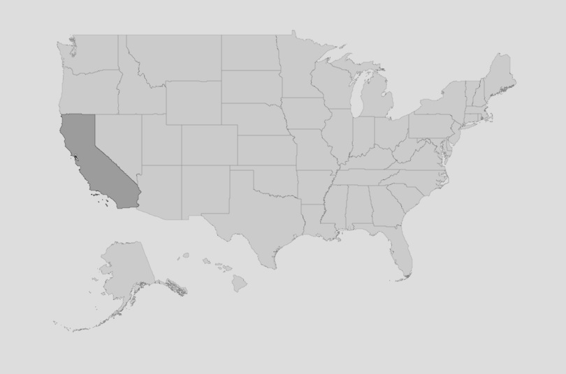
This is the map we’re going to create. It’s a simple grey map and each state darkens in color as you hover over it. I’ll show the same map after each style option is added so you can see what effect it has.

1
2
3
4
5
6
7
8
9
10
11
12
13
14
15
16
    ## create usa base map using leaflet()
    map <- leaflet() %>%
    addPolygons(data = states,
        smoothFactor = 0.2,
        fillColor = "#808080",
        fillOpacity = 0.5,
        stroke = TRUE,
        weight = 0.5,
        opacity = 0.5,
        color = "#808080",
        highlight = highlightOptions(
            weight = 0.5,
            color = "#000000",
            fillOpacity = 0.7,
            bringToFront = FALSE),
        group = "Base Map")
- line 2:
2 map <- leaflet() %>% leaflet() initializes the map widget. I save it to a variable called map (map <-) so I can run other code in the file without recreating the map each time. When you want to see the map, you can type map (or whatever you want to name your map) in the terminal and hit enter. R will display the map in the viewer.
- line 3:
3 addPolygons(data = states,addPolygons() adds a layer to the map widget. Leaflet has different layer options, including addTiles and addMarkers which do different things. You can read about them on the leaflet website. Since we’re using a previously created shapefile, we’ll add the shapefile to the map using addPolygons().
The first argument you need to specify after calling addPolygons is data = [data-source].
[data-source] is whatever variable your data is stored in. For me, it’s called states. This is either the processed data from part I of this series or the saved shapefile loaded above in the section called load data.
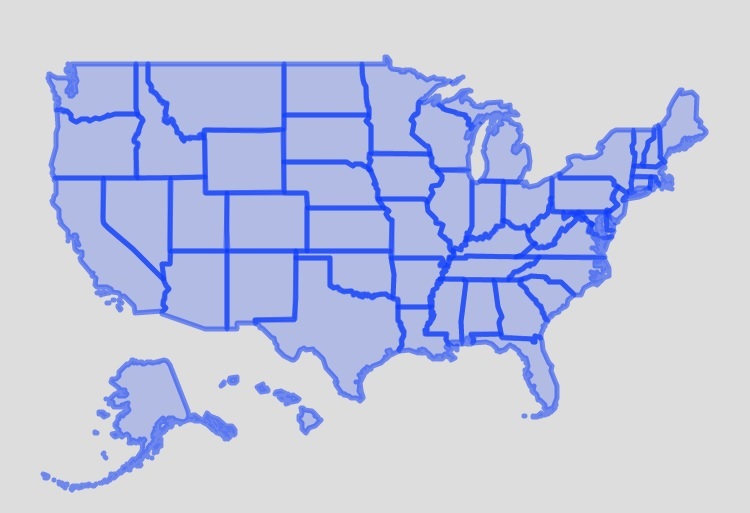
When you run only the first two lines, Leaflet will use its default styling. The base color will be a light blue and the outlines of the states will be dark blue and fairly thick.

You can leave the base map like this if you want, but all additional data will be added as a layer on top of this map which can become distracting very quickly. I prefer to make my base maps as basic and unobtrusive as possible so the data I add on top of the base map is more prominent.
- line 4
4 smoothFactor = 0.2,smoothFactor controls how much the polygon shape should be smoothed at each zoom level. The lower the number the more accurate your shapes will be. A larger number, on the other hand, will lead to better performance, but can distort the shapes of known areas.
I keep the smoothFactor low because I want the United States to appear as a coherent land mass. The image below shows three different maps, each with a different smoothFactor to illustrate what this argument does. On the left, the map’s smoothFactor=0.2, the center map’s smoothFactor=10, and the right’s smoothFactor=100.

As you can see, the higher the smoothFactor the less coherent the United States becomes.
addPolygons().
- lines 5-6:
5    fillColor = "#808080",
6    fillOpacity = 0.5,
fillColor refers to what color is on the inside of the polygons. Since I want a minimal base map, I usually set this value to be some shade of grey. If you want a different color, you only need to replace #808080 with the corresponding hex code for the color you want.
Here is a useful hex color picker. If you have a hex value and you want the same color in a different shade, this is a useful site.
fillOpacity determines how transparent the color inside the shape should be. I set mine to be 0.5 because I like the way it looks. The number can be between 0 and 1 with 1 being fully opaque and 0 being fully transparent.
- line 7-10:
7    stroke = TRUE,
8    weight = 0.5,
9    opacity = 0.5,
10   color = "#808080",
The next four lines define the appearance of the shapes’ outline.
The stroke property can be set to either TRUE or FALSE. When true, Leaflet adds an outline around each polygon. When false, the polygons have no outline. In the image below, the map on the left has the default outlines and on the right stroke = FALSE.

weight = 0.5 sets the thickness of the outlines to be 0.5 pixels. This can be any value you want with higher numbers corresponding to thicker lines. Lower numbers correspond to thinner lines.
The opacity property operates in the same way as fill opacity above, but on the outlines. The number can be between 0 and 1. Lower numbers correspond to the lines being more transparent and 1 means fully opaque.
color = "#808080" sets the color of the outline. I typically set it to be the same color as the fill color.
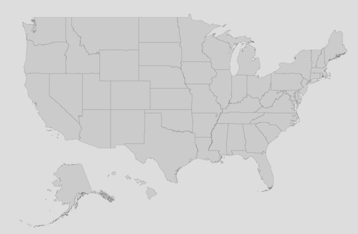
If you want a static base map* then lines 2-10 are all you need, as shown in the image below. I like to add some functionality to my base map so that the individual states become darker when they’re hovered over.

Lines 11-15 define the map’s behavior when the mouse hovers over the shape. Most of the options are the same as the ones used on the base polygon shapes, so I won’t go into them with much detail.
- static in this case means that hovering over the map does not trigger any map behavior. Users can zoom on the map, but hovering over a state or park won’t show a label or change color. A truly static map (like one with ggplot) is just an image of a map and has no zoom functionality.
- line 11:
11 highlight = highlightOptions(highlight = highlightOptions() contains the mouseover specifications. Here we’re setting the highlight variable equal to the values in the highlightOptions() function call.
highlightOptions() function call be named either highlight or highlightOptions. Naming anything else (e.g. Hi_Opt = highlightOptions()) will cause it to break.
- lines 12-14
12    weight = 0.5,
13    color = "#000000",
14 fillOpacity = 0.7,weight, color, and fillOpacity all operate in the same way as before, but whatever values you specify here will only show up when the mouse hovers over the polygon shape. Since we’re defining the values for the states in this section, the values will only apply when a state is moused over.
- line 15
15 bringToFront = FALSE),bringToFront takes one of two values: TRUE or FALSE. It only really matters when you have multiple layers (like we will in later parts of this series). When bringToFront = TRUE hovering over the state will bring it to the front. When bringToFront = FALSE it will stay in the back.
Since the base map has only one layer, this property doesn’t affect anything.
- line 16
16 group = "Base Map")group = "Base Map") lets you group multiple layers together. This argument will come in handy as we add more information to the map. The base map is the default layer and is always visible - though, when you use map tiles you can define multiple base layers. All other layers will be on top of the base layer. When using different groups, you can define functionality that allows users to turn off certain layers.
4. conclusion
You’ve created your first base map! Go ahead and run your mouse over the map and you’ll see the states turn a darker shade of grey.
The map is a fairly boring, grey map, but it’s the base we’ll use when adding in the national and state park data. In part III of this series we’ll process and add in the National Parks.
Liz | 17 Sep 2022